Glide identification
Plot tools
Throughout the glide identification process, plots will be generated from which you can inspect the data. These are plot instances created using the matplotlib library, which have some default tools that are used by the user to determine values to be manually entered by the user, so we’ll cover those tools now.
| Icon | Matplotlib tool description |
 |
Reset the original view of the plot |
 |
Back to previous plot view |
 |
Forward to next plot view |
 |
Pan axes with left mouse, zoom with right |
 |
Zoom to the selected rectangle |
 |
Configure subplot attributes |
 |
Save the figure |
Select tag data to process
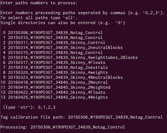
At the start of the glide processing you are prompted to select the tag data directories which should be processed. You can type all for processing all tag directories or type a list of ID numbers for those you wish to process separated by commas (e.g. 0,4,6).
If the data has not previously been loaded by pylleo you will see then see output pertaining to the loading of the data, and a binary pandas pickle file will be saved in the data directory for subsequent loading.
Selecting a cutoff frequency
The Power Spectral Density plot will be then be shown, which is used for determining the cutoff frequency to split the filter the accelerometry data.
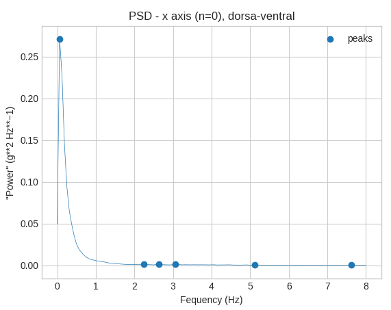
Using the tool select the area to the left including the peak and
the area of the curve up to the point at which it flattens out. The frequency
(x-axis values) used for the smartmove paper was selected to be the point past
the falling inflection point which was roughly half the distance between the
maximum and the falling inflection point (pictured below).
Note
User input required
The frequency you determine from looking at these plots can then be entered in the terminal.

Review processed data
The accelerometer data will then be low and high-pass filtered, and plots of the split accelerometry data will be shown with the original signal, low-pass filtered signal, and high-pass filtered signal.
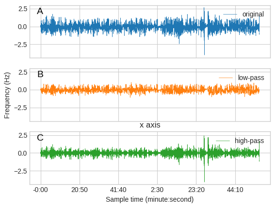
You can use the tool to get a better idea of how the signals have been
split at higher resolutions.

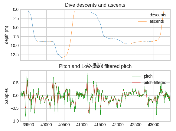
Plots of the identified dives are then shown with descent phases labeled in blue and ascent phases labeled in green. The subplot beneath the dives shows the pitch angle of the animal calculated from the accelerometer data, with the low filtered signal (red) plotted on top of the original signal (green).
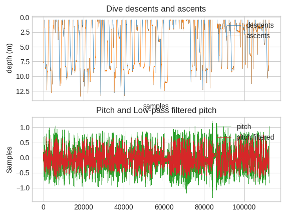
Zoomed in used
Selecting a glide threshold
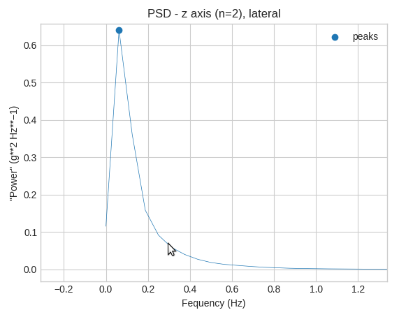
A diagnostic plot for determining the threshold for determing what portions
of the accelerometer signal are considered to be active stroking vs. gliding
will be displayed. will then be displayed showing the PSD plot of the high
frequency signals for the x ans z axes, along with a plot of these signals over
time. In the PSD plot, the peak in power (y-axis) should occur roughly at the
frequency (x-axis) the characterizes stroking movements. Zooming into greater
detail in the acceleration subplot using the tool, You can then look at
areas which appear to have relatively steady activity below this frequency
(y-axis).
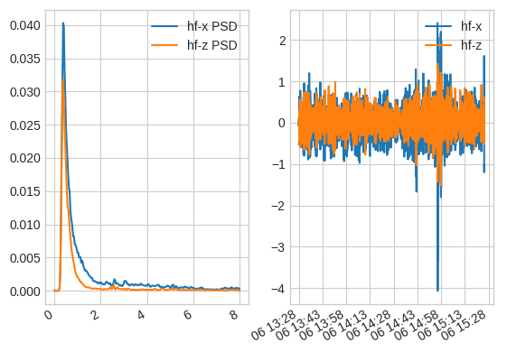
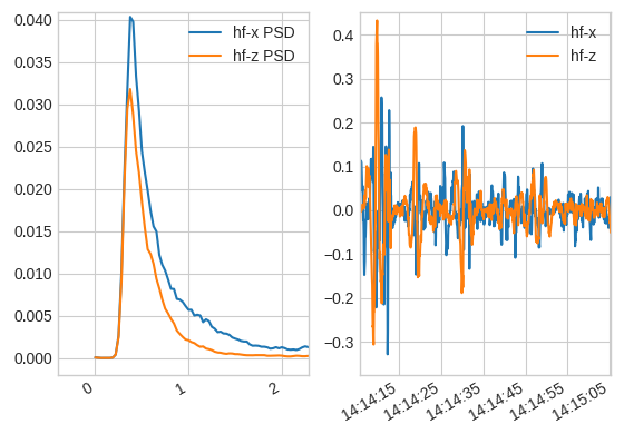

After determining the threshold, enter it when prompted in the terminal

Glide events will then be identified as as the areas below this threshold, and sub-glides will be split from the glides using the sgl_dur value passed to (e.g. a.run_glides(sgl_dur=2)).
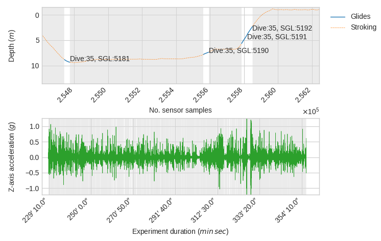
Reviewing split sub-glides
A plot of the depth data and high frequency acceleration of the z-axis will be shown with each sub-glide highlighted and the sequential labels of the dive number in which it occurred and the number of the sub-glide.
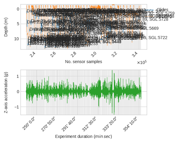
Zooming in with will give you better view of things.